Page One Web Solutions
Our design of the month is a creative corporate identity concept from Page One Web Solutions. Page One Web Solutions are a “multi-talented team comprised of experienced marketers, writers, web developers & project managers.†With combined experience spanning more than 50 different industries, Page One has the talent and know-how to provide you with stellar web design and internet marketing solutions.
Founder, Patrick Sullivan, took some time out of his busy schedule to talk with us about their quirky plastic cards.
Company Name:
Page One Web Solutions
Graphic Designer:
Jeremy Lindemann & Shamus Alley
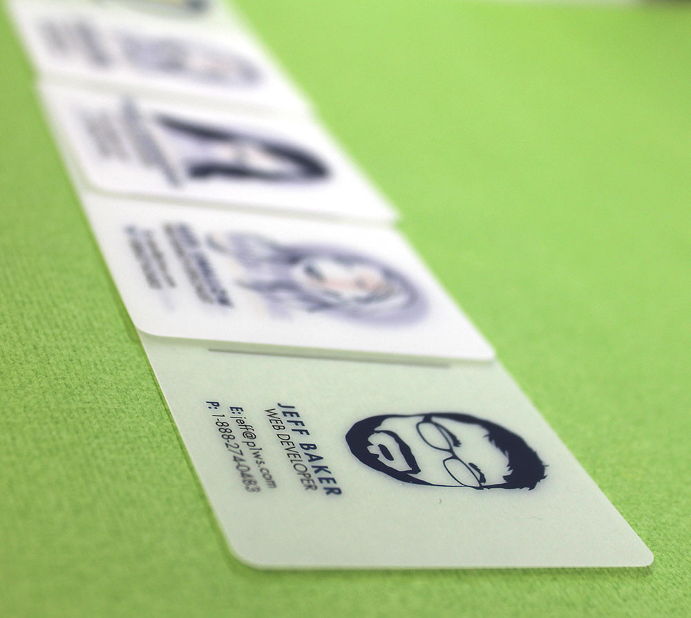
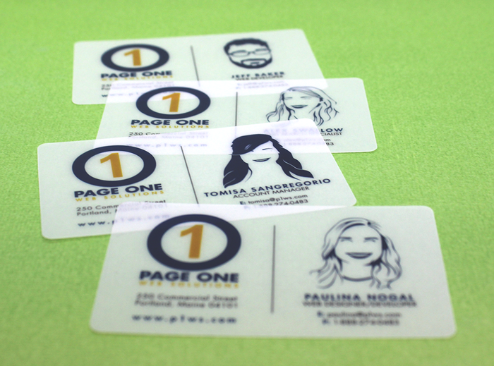
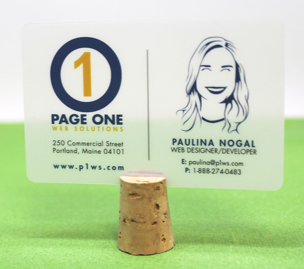
Opaque White Plastic
Social Media Links:
----------------------------Interview-----------------------------
Q: Could you please provide a brief history of your company and the type of services you offer? Â
Founded in 2006 by Patrick Sullivan and Patrick Robinson,
Page One Web Solutions, located in Portland, Maine, offers web design, web development, and internet marketing services to our clients. We take the time to listen to our clients' challenges and goals then create custom campaigns tailored to their needs. We specialize in WordPress website design/development, WordPress Multi-site Development, WooCommerce eCommerce platform, SEO, Paid Search, and Google Analytics.
Q: Can you talk about some of the inspirations for your business card design?Â
We did quite a bit of research to come up with the designs for our business cards. In our (digital) industry, many times business cards get thrown right into the trash after adding it to the company CRM. We wanted cards that were fun and unique, like our business, as well as memorable. We have found that, not only do people like our business cards, they are great conversation starters! We've even heard people say, "I want to collect them all," like sports cards!
This article was used as part of our inspiration.
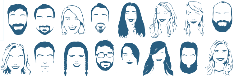
Q: Portraiture is not something you see very much of in corporate business design. What were the motivations behind this design element?
We wanted our business cards to have a personal touch - beyond our name, company logo and contact information. Since the cards would be transparent/translucent, people would be able to place the cards over their licenses or hold them up in front of someone to see what they would look like with those facial features.
Q: The thickness of our plastic cards is something people either love or aren't happy with (we are hoping you are in the former camp.) What are some advantages or disadvantages you can see with the thickness of our plastic cards?Â
Some advantages are that the thickness makes them unique than a paper card, especially helpful when you put your business card into a drawing (they tend to get picked!). Because of the material they also don't rip and rarely fold. Some disadvantages are that they are a bit slippery feeling and hard to write on without a permanent marker.
We had originally considered a completely clear card, but we were concerned about legibility issues, so we went with a frosted/translucent one instead.
Q: A few other design elements that pop out are bold colors and bold fonts in all caps. All caps in particular is something many people use very minimally or shy away from completely. How do these elements represent your company?Â
These are branding elements found in our logo and all our printed material. It was important to keep consistency amongst our brand.
Q: If you could pick any movement in art or graphic design that best fits with your company’s aesthetic, which one would you pick and why?Â
Our design style takes elements from various popular movements, but particularly the Swiss Design style with its grid-based layouts, left-justified sans-serif text, and use of white space. We find that it is a strong fit for the verticals in which we work, allowing for high legibility, simplicity of presentation, and emphasis on areas of interaction and conversion.
Q: How was your experience with Morning Print? Anything we can approve upon?
Overall we have really enjoyed our experience working with Morning Print. The price and quality are unbeatable and our business cards always receive positive remarks when handed out. Turnaround times are amazing. They are something we're all truly proud of.
Morning Print would like to thank Page One Web Solutions for contributing to this blog post and their ongoing support of our products + services. For more information on Page One Web Solutions, please visit their website.
Â


 About Us >
Design of the Month
About Us >
Design of the Month