Bellows Tattooer!
This month's design comes from a tattooer in Maine specializing in traditional black work tattooing. His retro design and expert use of our finishing options really impressed us. We spoke to Bellows about his design inspirations and the tender loving care that went into producing his stellar business cards.
Â


Company Name: Bellows Tattooer
Graphic Designer: Bellows Tattooer (Nick Ready)
Website: heynicetattoos.com
Order Specifications:
---------------------------- Interview -------------------------
Q:Â Could you please provide a brief history of your company and the type of services you offer?Â
I am Bellows and I tattoo in Portland, Maine and Montreal, Quebec. I specialize in traditional and illustrative black work tattooing. Tattoos serve so many purposes and its part of my mission as a tattooer to do work that will age well, both physically and sentimentally. Irregardless if I'm painting tattoo flash or designing for a custom project, I generally pull reference and inspiration from folk arts, early print advertising and traditional tattoo imagery. Through that process, I aim to arrive at something that doesn't feel dated but is at the same time familiar and built upon tried and true principals of tattooing and design.
Q: You are now the second tattooer to be featured as our design of the month! Many of our best designs are from tattoo shops. What would you say are some of the similarities/differences between tattooing and designing?
I find that I approach both mediums in a similar fashion and apply similar principles to both. For instance no matter what I am doing I try to live by the old navy rule of design; Keep It Simple Stupid (KISS) and secondly I believe that no good design or tattoo happens by accident. It does not mean that you can't be expressive or have something delicate and intricate, but that the design should be appropriate for where its going. In order to keep things simple one almost has to get too carried away while drafting in order to establish the most paramount information and omit any unnecessary minutia to arrive at a successful end. In short, I find that at least I produce better work when I keep things deliberate and succinct.
When the design becomes a physical product is when tattooing and designing become most different. You design and make cards and logos for people to show off and give away. With a tattoo the wearer may want to show it off and let the world know about it or it could be something private that they have no desire to share with anyone. and its your duty as a tattooer to give it the same amount of attention no matter what purpose that tattoo serves. There is also the issue of permanence and longevity. A good tattoo will wear well with age and must be designed with that in mind. Whereas you can get away with more subtleties and take advantage of many illustrative devices on a design project that wouldn't hold up in the long run on a tattoo.
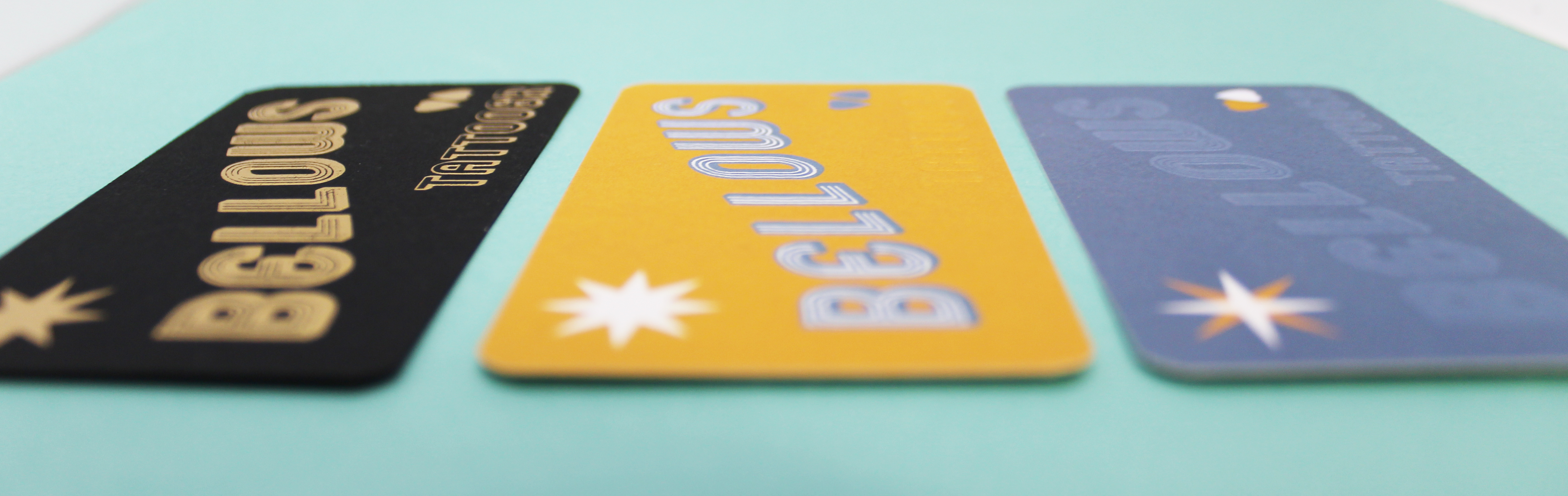
Q: We were very excited when we saw your designs as they are a prime example of what finishing options can add to business cards. Many clients have embossing as an addition to a completed design, but your cards feel like they were very much designed around the embossing. How important was this feature to your overall vision?
Like tattooing, when I do any sort of design work I do so in a "site specific" manor. So regardless of whats in my head beforehand I like to figure out where/what I am designing for and what tools I have at my disposal. Then I create a design based on those factors. This process was certainly a big part of my design which I kept simple so that the cards would need a little extra something nice for when they're up close and in your hand. Embossing gives it just that and makes you want to pick it up and see what its all about. It was necessary to give the embossed features enough space to stand out and not compete with other elements of the card.
Q: There is a definite retro feel to your card designs. Â What eras of graphic design are you inspired by?
I mainly draw inspiration from pre-digital design, in particularly early print advertising and always aspire to achieve that nice balance of timelessness and relevance in my own work without getting too kitschy or "throw back"
Q: The colors (including the foil) are all muted tones and matte looking. How does this color scheme represent you as a tattoo artist?
Well quite literally 3 of my favorite colors to use in a tattoo- black, paynes grey/ blue-grey, and a golden yellow among others, but  I feel like I can do no wrong using those. In addition to those colors, I prefer a limited palette and earthier colors in general. Not unlike the kind of colors you might find in a colonial home.
Q: Do you plan on offering graphic design services in addition to your tattoo services?
I really enjoy doing design work, but will only take projects on a case by case basis so I can give potential design clients the same amount of attention I give the people I tattoo.
Q: You chose aquarelle paper for the two cmyk printed cards. What drew you to this paper stock?
I like the way that the paper absorbs color and the slight tooth it has. The overall design would be ill-served by something slick, bright and shiny. I primarily paint flash on watercolor paper because of those same reasons and it really translates well to tattooing. Given the option to have my cards printed on watercolor paper it seemed like the natural choice.
Q: Which of your three designs do you like the most?
Originally I was most excited about the grey blue cards, but by the time I finished all 3 I was quite eagerly awaiting the yellow card. The black and gold card was a last minute decision that I did not have expectations for either way but went ahead with the order anyways. After having the cards in hand I can say I am most stoked on the matte gold on black card. Its flashy but classy and really catches your eye.
Q: We’d like to thank you for all the prep work you put into your order. We were able to process your order so efficiently because of not only how well you designed your cards, but the extra time you put into researching what we needed to give you the best results. What advice do you have for anyone wanting to create a design like yours?
Take your time, look at cards and advertising that inspire you. Find out how they were made. Print proofs of your card and hang them up across the room, try different designs, cut them out and see how it looks in your hand or wallet or whatever else you can think of to arrive at a design you're happy with. Don't force the printer to read your mind. Articulate what is is you want, and if you don't know the right way to say it, then provide examples of what you think you want the end product to look like and ask somebody how to get there with your design. Also keep it simple and easy to read, your business card isn't the place for your mission statement.

Q: How was your experience with Morning Print? Anything you’d like to see us add in the future?
I've got nothing but good things to say. It's totally a user friendly company that provides enough services/options to really create a product that represents your business, self, project, etc. etc. Not to mention Morning Print is incredibly efficient and timely.
Although I am totally pleased, it would be really awesome if you would figure out a way to print felt on cards already. Please.
Q: Is it true that all dogs go to heaven?
No. Sorry.
Q: Any other thoughts/information you’d like people to know about yourself?
Be responsible and inform yourselves and look through portfolios, websites, social media, whatever, whether you're getting a tattoo or getting a flyer made for your dance party. There are enough people out there doing great things that nobody needs to twist anybodies arm to give or get anything.
Also thank you for the opportunity to give my two cents and ramble on a bit.
Morning Print would like to thank Bellows Tattooer for contributing to this blog post and his ongoing support of our products + services. For more information on Bellows Tattooer, please visit his website.Â
Â


 About Us >
Design of the Month
About Us >
Design of the Month