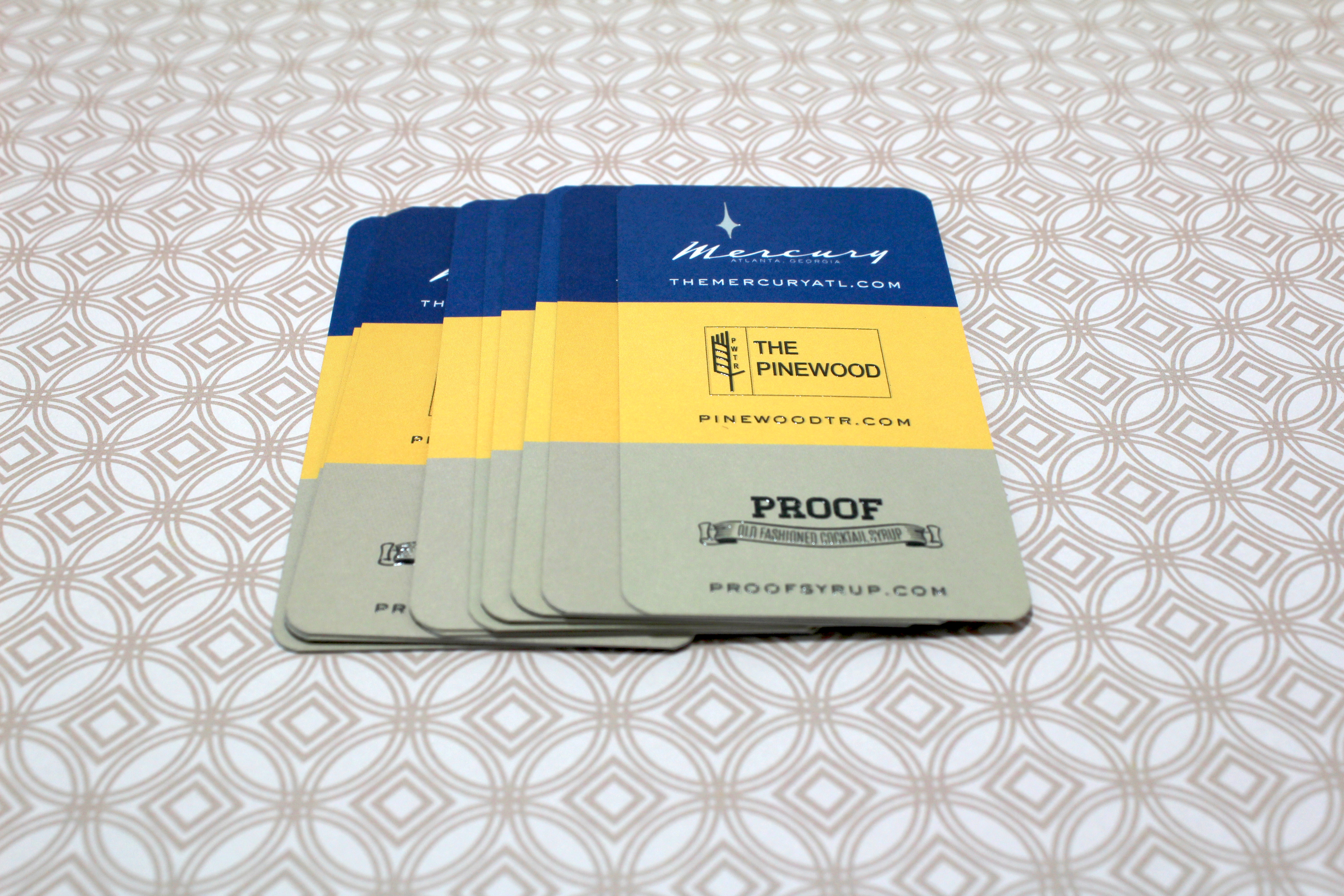
We are an Agency. But we’re only two guys. We have done a lot of everything for our clients. Branding, communications, online and off, tradeshow, at this point if we haven’t done it you probably don’t need it.
Q: Can you talk about some of the inspirations for the Mercury business card design?
Mid Century modern

Q: How does the color blocked scheme tie into Mercury’s overall theme?Â
The Mercury, It is the flagship restaurant of the group that has a mid century modern vibe. It is a play on the bold clean lines of that era.
Q: How are the three businesses on the card related?
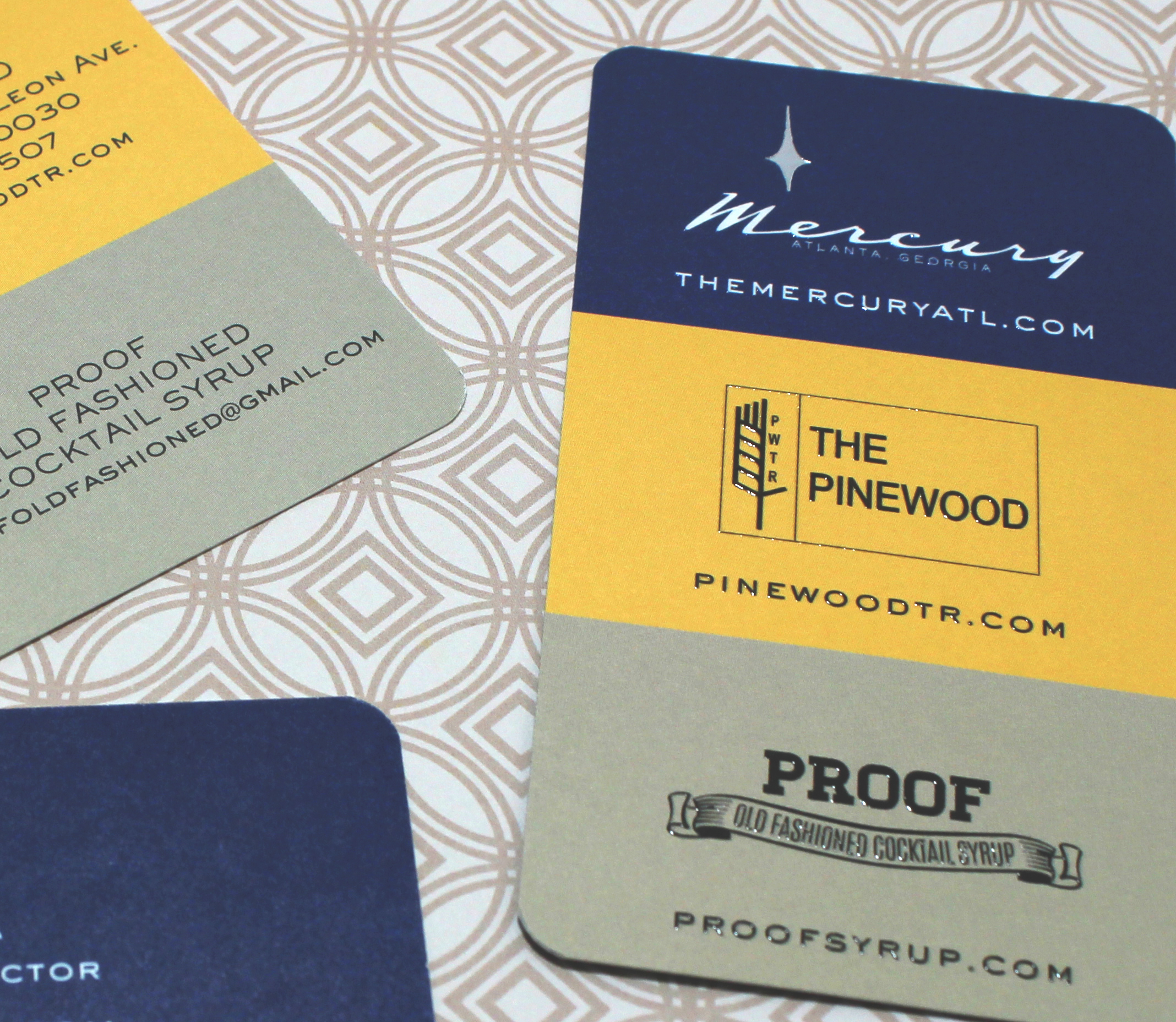
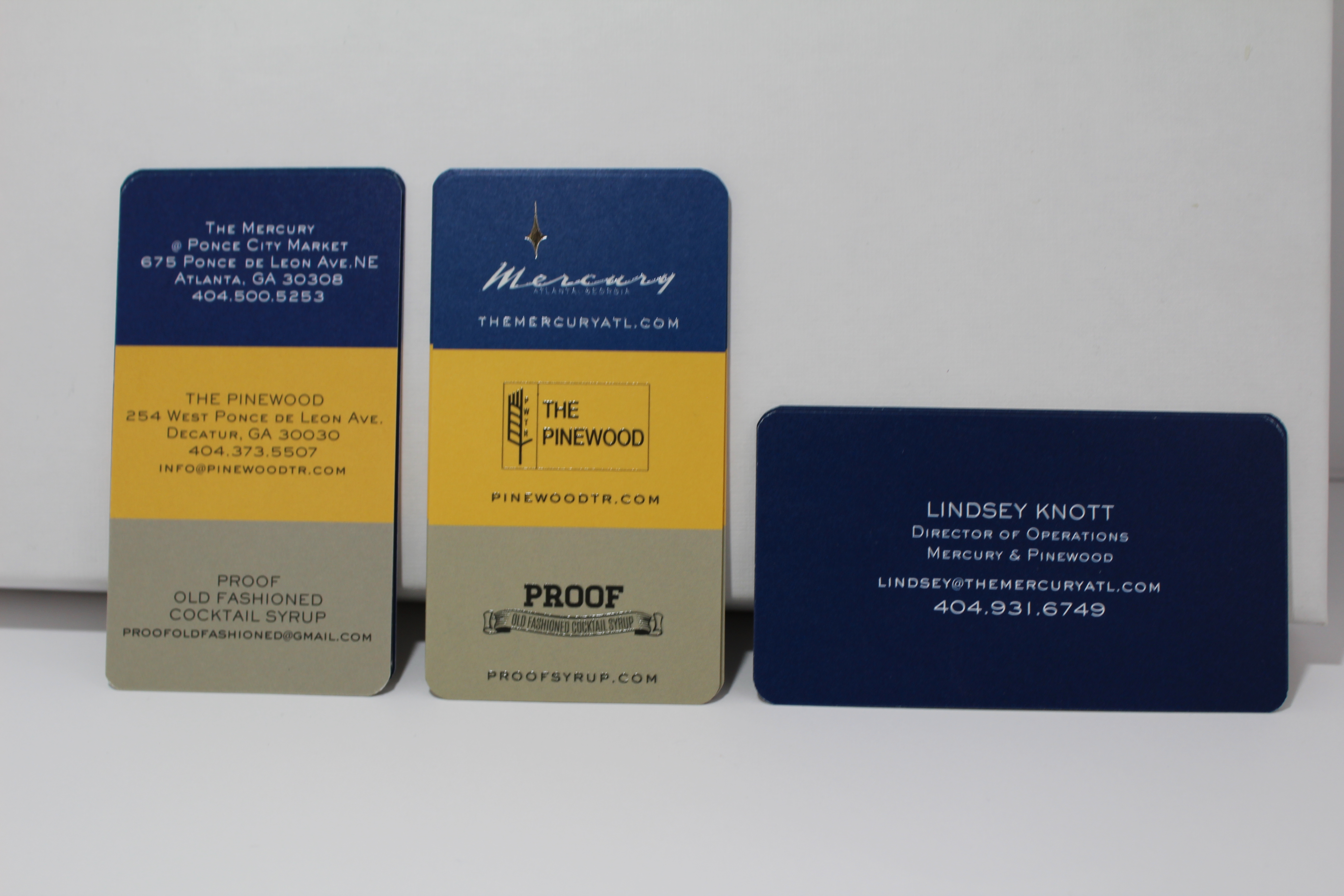
The Mercury is one of three business. It is the flagship restaurant of the group that has a mid century modern vibe. The other restaurant, The Pinewood, is a neighborhood bar that serves extraordinary cocktails and reinterpreted regional Southern fare. The third business, Proof Cocktail Syrups, grew out of The Pinewood. They were developed by the bartenders and are now sold in gourmet epicurean stores. Each business has their own look but are linked in one way to another. the blocked design serves as a conduit to all three.

Q: Raised ink is one of our most popular finishing options and can sometimes be misused if not integrated to the design properly. What is your advice for using this option?
Will it help the overall aesthetic of the design and how it is used. I like to use it in a way that will give the card an unexpected appearance. Using it as a clear ink over white type gives it a more dimensional look that UV varnish without the cost of an embossing die. I have also used in place of Spot UV to bring out the contrast of a pattern overlaying the card. Be smart and don’t use just because you can.
Q: What were some of the overall goals for this design?
"To crush my enemies -- See them driven before me, and to hear the lamentation of their women!†oh wait, that was for something else. With three distic businesses the the client wanted to be able to have one card not three different ones to carry and hand out especially when working with outside suppliers and vendors
Q: Did you consider other stock options other than heavy silky matte?

Not in this case. The paper stock needed to have a that silky finish to go with the overall vibe. And the printing looks great even when their no effect as foil or raised ink applied.
Q: If you could print these cards again with different finishing options or paper, what would you choose?
I would like to use the Heavy Sumo but you can’t combine some of the effects I need to do with this particular design
Q: If you could pick any movement in art or graphic design that best fits with your company’s aesthetic, which one would you pick and why?
Nobody puts baby in a corner
Q: How was your experience with Morning Print? Anything we can approve upon?
I have produced several jobs with Morning Print for clients as well as our own business. I would like to see more two sided options on more of the current stocks available.
Morningprint would like to thank Invisible Rocket for their ongoing support of our products and services.
Â
Â
