Name: Sarah Williams
Company Name: Sky Williams
Photography
 Â
Â
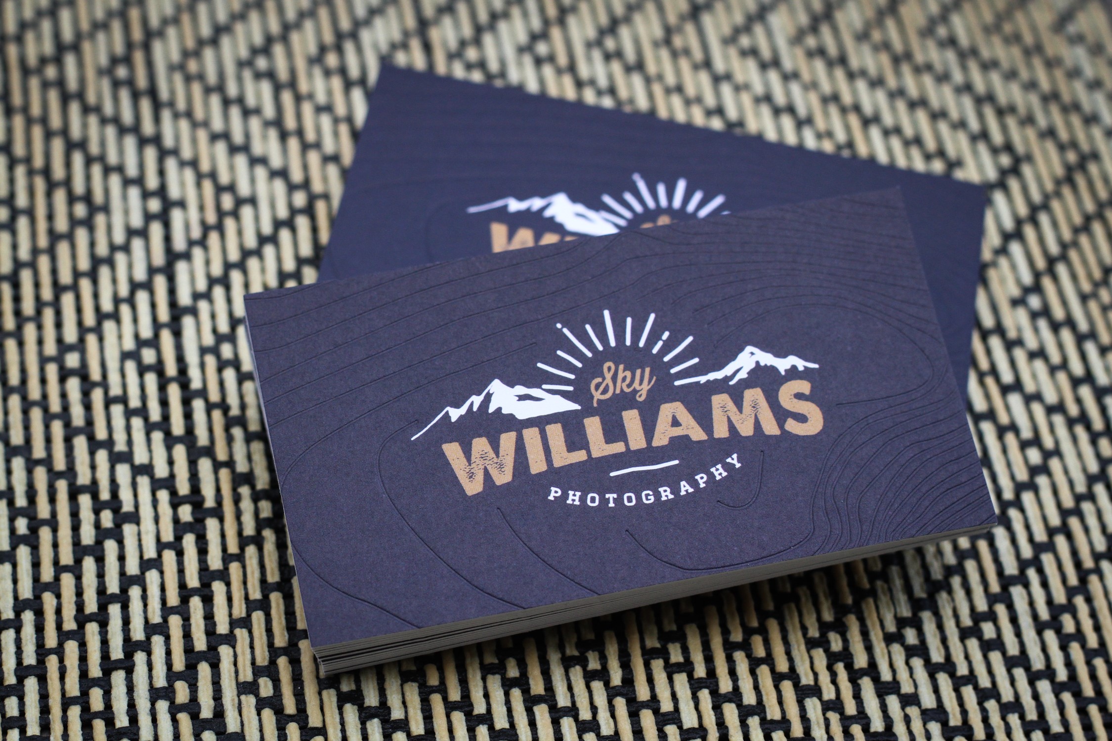
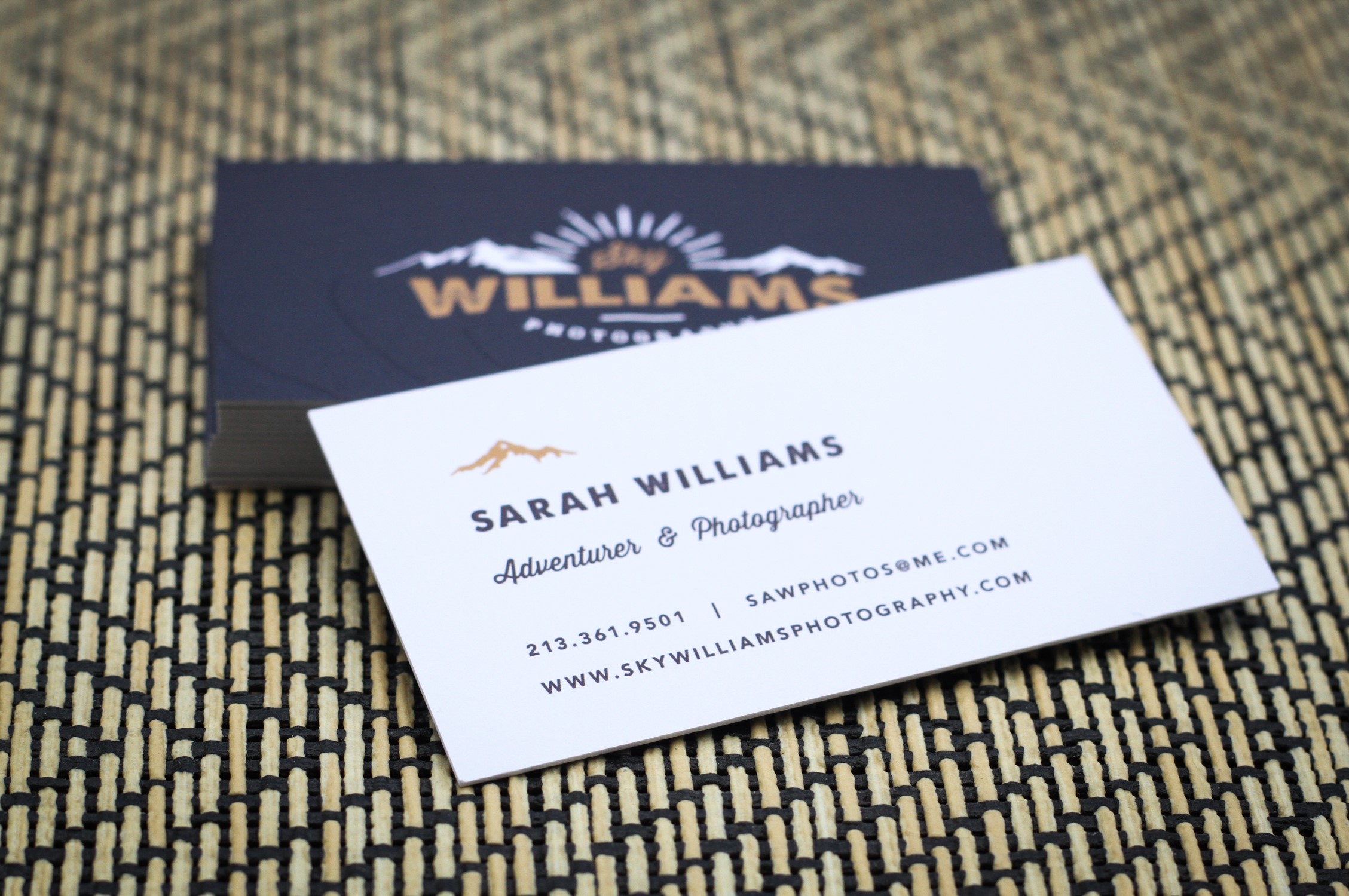
Business Cards
by MorningPrint[/caption]
Q : Briefly tell
us about your company, and its history. What kind of services you
offer?
A: My
business was officially established in 2016, but really, the history of my
business is ultimately the history of my personal development. I’ve had a
camera in my hands since I was in the single digits and have photographed
everything I could. I’ve shot weddings, events, headshots, food, portraits,
artwork, everything you can think of to broaden my skills and to find what
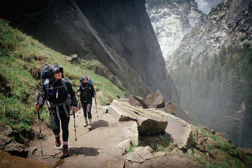
style of photography makes my heart sing. While I developed my skills as a
photographer, I simultaneously discovered my love for an active life lived
outdoors. I’ve taken up backpacking, climbing, trail running and continue to
explore every outdoor activity possible. Somewhere in all of that I have
narrowed my path of work into two categories. The first is brand building. I
create content for businesses, start-ups, and individuals who are looking to
visually represent what they do. This work is typically used for social media
and community outreach. The second is simply, storytelling. I create series of
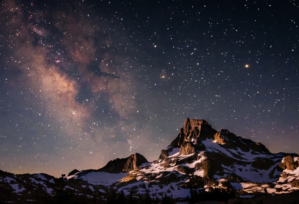
work that tell the stories of people, products, and ideas. I focus on outdoor
activities, exploring, and adventure.
- Instagram:Â @sarahskyann
Q : Your design inspires us, what inspires
you?
A: I am
inspired by passionate people who trade comfort and routine for discomfort and
discovery. I am inspired by generosity, authenticity, and kindness. I am
inspired by the earth’s wilderness and magic.
Â
Q : We love your
design, it is simple, bold, and playful while still being simple. How did you
come up with this design / concept?
A: I
worked with a friend named Sarah Rose Andrew (http://www.sarahroseandrew.com)
who is an incredible freelance graphic designer to help bring the vision of my
brand to life. We worked on this design for a couple months with many revisions
and additions. It came together quite naturally. She suggested taking a
hand-drawn, outdoorsy approach and I completely agreed. The mountains were not
initially a part of the design. We played around with making the letters of my
last name into mountains because the line work suggested a landscape, and it
just made sense to incorporate my favorite natural feature into the design,
completing the landscape theme.Â
Being a
photographer, using an image on the card would have made sense, but I wanted a
more general and timeless feel. I wanted a design that represented more of who
I am as a person, than a single image would suggest. My work varies, but my
personality doesn’t. I wanted a design that would work for the next few years
as my business develops.Â
- Business cards
by MorningPrint
Q:Â You
embossed a design that looks like wood grains. What made you go this route
as oppose to printing a wood grain instead?
A: I
always like there to be a little something extra, a little added depth if you
will. So I knew I wanted to utilize the embossing
option. It adds to the design without taking away from the simplicity. It is
actually the contour lines of a topographic map representing the west side
approach to the summit of Mt. Whitney (the highest summit in the contiguous
U.S). It’s a special place to me as it was the grounds for much of my personal
development as a human, and as a photographer. I absolutely loved the idea of
incorporating that extra piece of me, and my story, into my
card.
Q: What made you
choose a navy color for the background?
A: “Navy
is a common representation of confidence and power as well as intelligence,
stability, and professionalism. Blue, in all of its hues, shades and tints, is
the most frequent color found in nature and being a travel and nature
photographer, I wanted to have that association.†–Sarah Rose,
designer
Â
In working
with Sarah, we explored a couple color options but I decided this shade of navy
worked best for the design. It’s natural and comforting, and in my line of
adventure photography, comfort is a rare commodity but is something I want my
clients to feel. With me, they are taken care
of.
Â
Q : What made you
choose the
Sumo Nouveau? Have you considered any stocks or options for future
orders?
A: “As for
the stock choice, that was moreso informed by the design and production choices
of the debossing technique utilized. However, I'm always drawn to thick,
textured, heavy paper because it's much more substantial and your logo and business cards are the face of your
company. It's the first thing people see and develop their 3 second impression
on so it's important to make it stand out and memorable. “ –Sarah Rose,
designer
Â
Q: How was your
experience with Morning Print?
Anything you’d like to see us add in the future?
A: I had a
great experience with Morning
Print. Prompt replies, excellent personalized customer service, and easy
website navigation. I am very pleased with the fabrication of my cards. I will
be recommending their services without a doubt.


 About Us >
Design of the Month
About Us >
Design of the Month