1. Name: Stephanie Diaz
2. Company Name: Somewhere in Wonderland
3. Website: Currently being created, for now I have my instagram as my main source @_somewhereinwonderland_
4. Give a brief history of your company and the services you provide:
Since I was a little girl I loved all things that involved art or something that allowed me to use my creativity. Through time it evolved into Graphic Design. I studied Communications and Entertainment in High School, majored in Graphic Design in College. Pursued a career in Graphic Design and as I progressed in my field I realized I still loved to paint, I still loved to photograph, I still loved to Brush Letter etc and yet the only title that followed me around was “Graphic Designerâ€. I hated having to limit myself to just one form of art medium. Why couldn’t there be a place that did it all? Insert Somewhere In Wonderland. A company that has no limits to what it can create for an individual. From branding, to creative prints, to wedding stationary, to unique merchandise. Sky’s the limit. Somewhere In Wonderland is your one stop shop for all your whimsical creative needs! We are constantly creating for all those who have a special event, a business that needs to be reinvented or just beautiful unique pieces that you wanted added to your life. Don’t have the ideas? Well, not to worry we also offer a unique line of pre-designed items for anything you might be looking for.
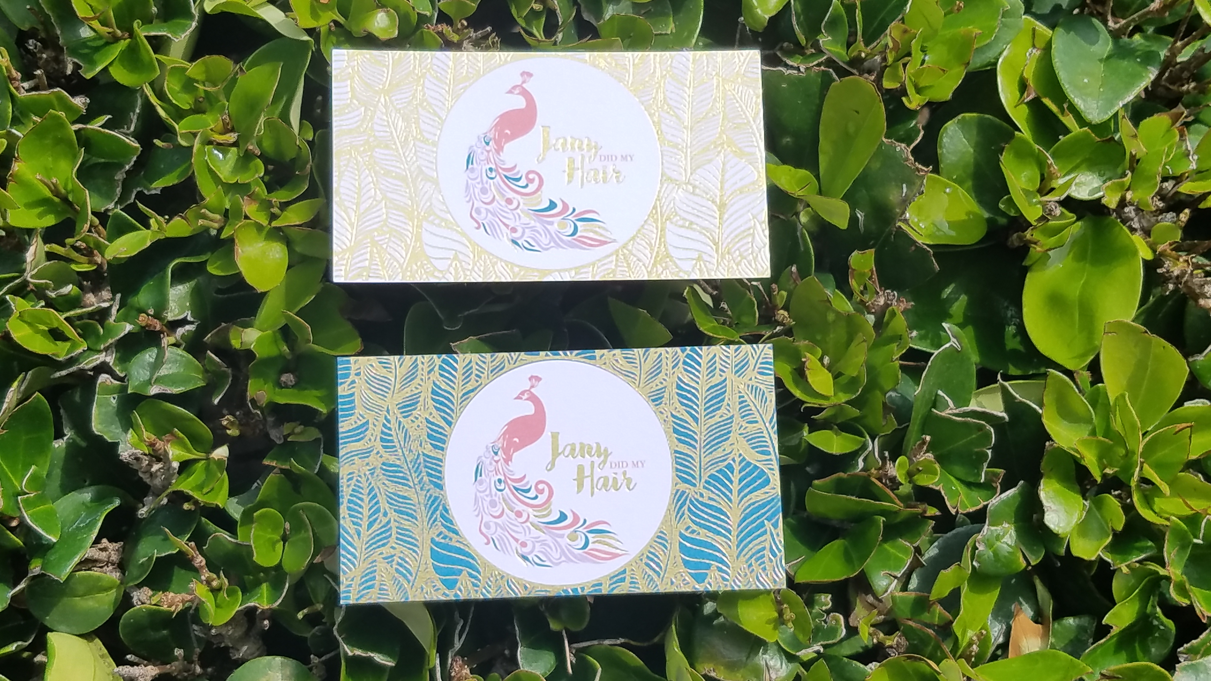
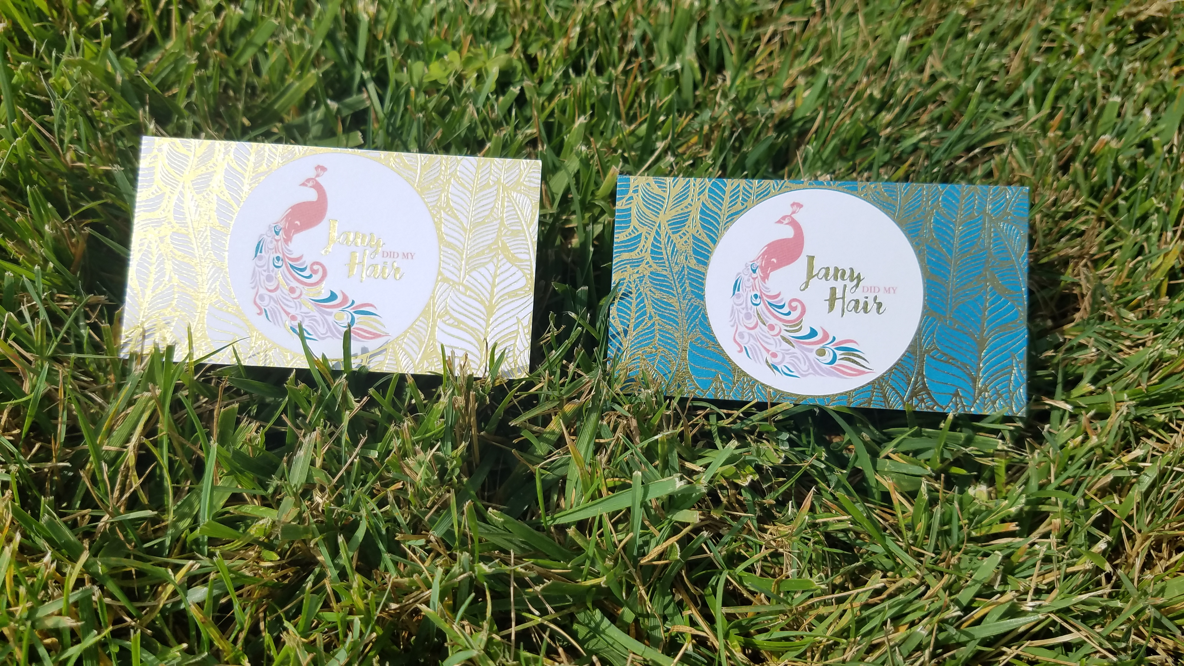
5. Our favorite element of your design is the glossy gold foiling. We find that too much foiling on one card can easily cause it to look heavy while losing its eye-catching appeal. How did you manage to use such extensive foiling and keep the design appealing?
I’ve learned to not stick to rules when it comes to design. It’s all about aesthetics and what appeals to the eyes. We never know what looks good until we experiment and try it out. My client indicated she loved Gold and Elegance. BOOM, the idea almost immediately came into my head. I played around with several different concepts and fell in love with the delicate pattern over a solid background. Keeping the background a solid color coupled with the gold pattern overlay was the perfect balance without making it look cluttered or tacky. The contrast I think is what plays well and makes all the foil work.
6. What made you choose Heavy Nouveau paper? And what was the difference that made you choose it over the Heavy Silky Matte?
It was actually you guys! I asked what paper was recommended with the foil, since I had never printed with Morning Print prior to this and Karen, who has been beyond helpful, recommended the Heavy Nouveau Paper. I am glad she did cause the final product was beautiful!
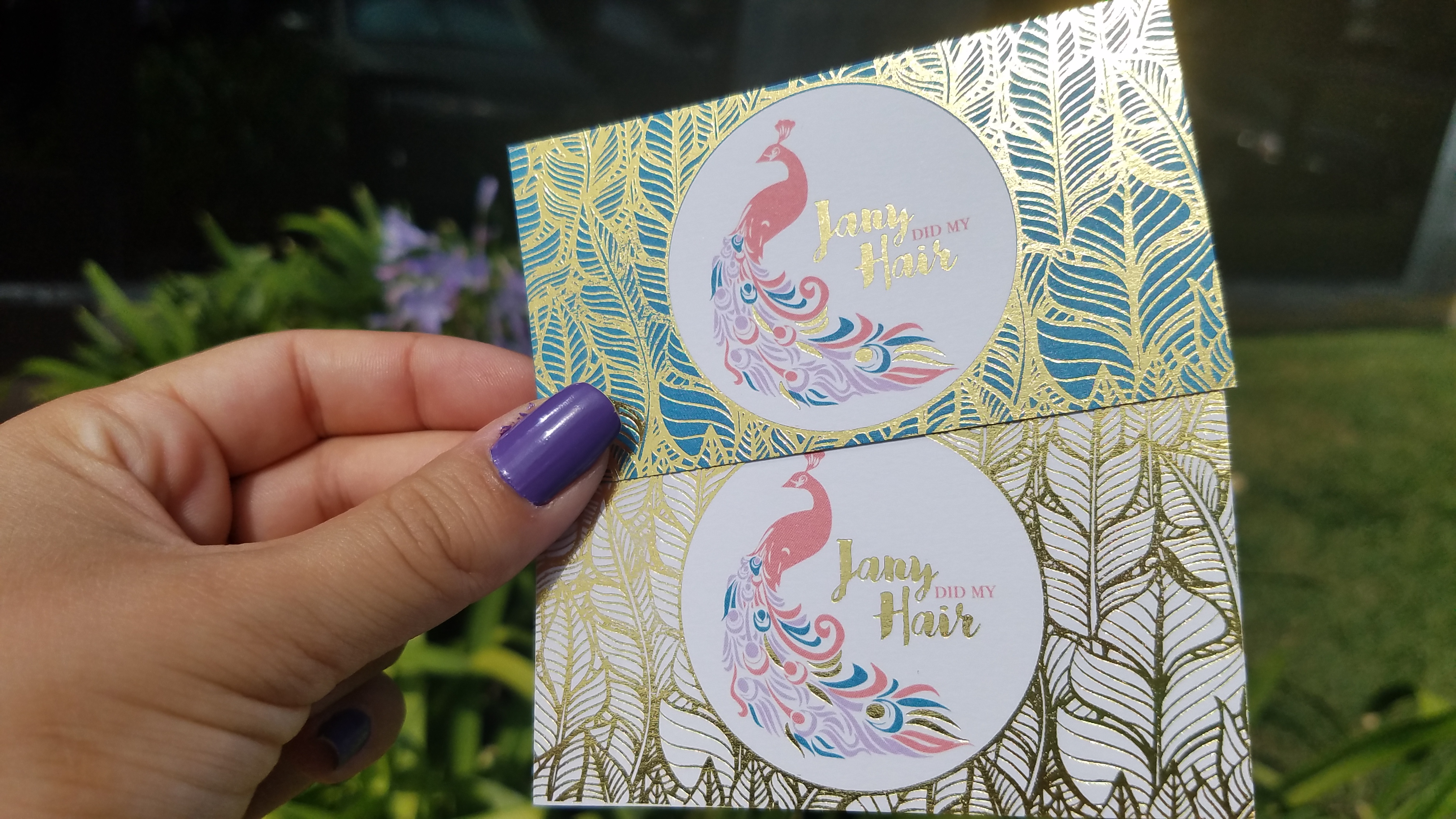
7. You created two separate design fronts; one with a green color and the other with the white stock. Why did you have two different designs?
When I create items for my customers I like to give them options. Sometimes one design is not what they are looking for but the second one is! Along with the options I also give them colors, fonts and other selections to choose from. With this design she loved both the white and green color option. She couldn’t decide which she liked best so why not choose both?
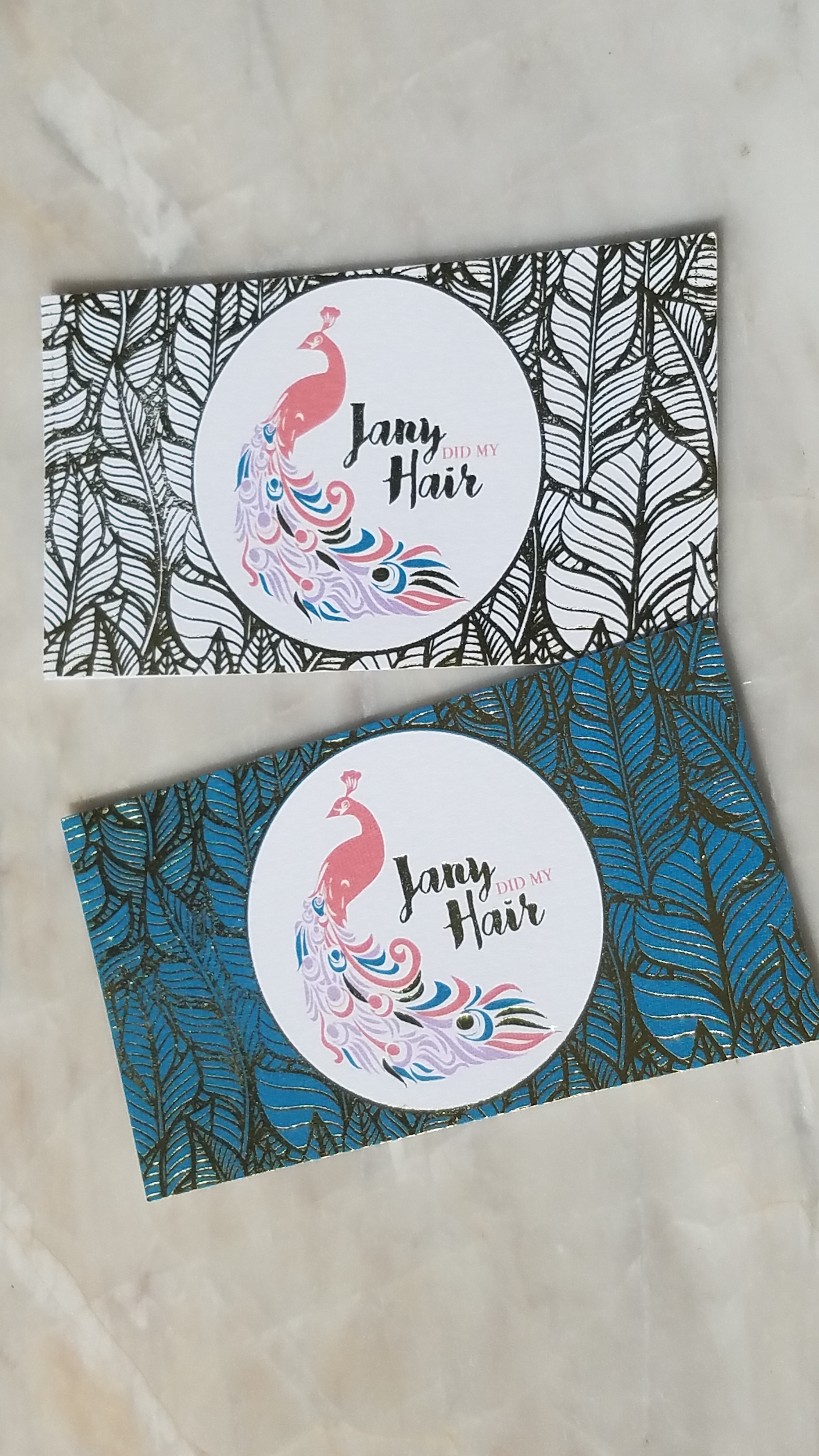
8. The peacock character is enchanting. How did you create it to look so simple yet glamorous?
I was utterly obsessed with the peacock concept. The Hair Artist I designed this logo for already knew she wanted a peacock in her design because her husband had incorporated that into her branding idea. She just wanted it revamped and modernized. I loved the idea because it was unique. I mean how many peacocks do you see in logo designs? And then I wondered why not they are so stunning. Peacocks are beautiful, but if not done correctly the designed could’ve been too busy. I had to find a balance. I opted for a simple vector that incorporated the color elements that she loved. I wanted something that flowed and that’s why the feathers kind of melt into her company name. It all worked very well together.
9. How would you describe the service you received at MorningPrint?
Morning Print has stellar service and quality. They truly went above and beyond. I had replies from them in literally hours time. All my questions were answered, and I ask A LOT of questions. The turn around was unbelievably fast and the quality was amazing. Not to mention the affordability in comparison to several other vendors I have worked with before. Morning Print will easily be on the top of my list of Go To’s from now on!


 About Us >
Design of the Month
About Us >
Design of the Month