1.Project
Name: ReTreat Gelato & Sorbet -
www.retreatbvi.com
2.Designer
Company Name: Jess Glebe Design
3.Website:
www.jessicaglebe.com
4.Business
Contact: website: jessicaglebe.com/contact
Instagram: @jessglebedesign
Â
5.
Please give us a brief history of your business and some of the services you
provide.
We believe branding
agencies, regardless of their size, should be equally as passionate about their
projects as their clients are; therefore, we personally commit ourselves to
each project we undertake as if it were our own.
Jess Glebe Design has
been heavily involved in various award-winning branding and package design
initiatives since 2006. Recently, our designs for State Street
Honey and Hotel Hive were awarded prestigious
GD USA awards for both logo and package design, and our Break the Mold
Chocolate packaging was awarded The Dieline's 2017 Neenah Paper
Award.
Through the years,
we've enjoyed working for companies large and small on a variety of initiatives
— from logos, branding, and copywriting, to advertising and package design. We're
proud to note that many of our clients were referred to us from
past clients, which we attribute to a job well done.
Â
6. Our
favorite element of your card is the splattering of color. It pairs up
perfectly with the Heavy
Aquarelle paper you chose. Do you have any advice for those who are
trying to pair their design with the best paper?
We chose the Heavy
Aquarelle paper for the natural, toothy texture it provides, as well as its
innate watercolor look. The splattering of printed color feels even more
authentic with this paper stock, appearing as if each card were painted by
hand.
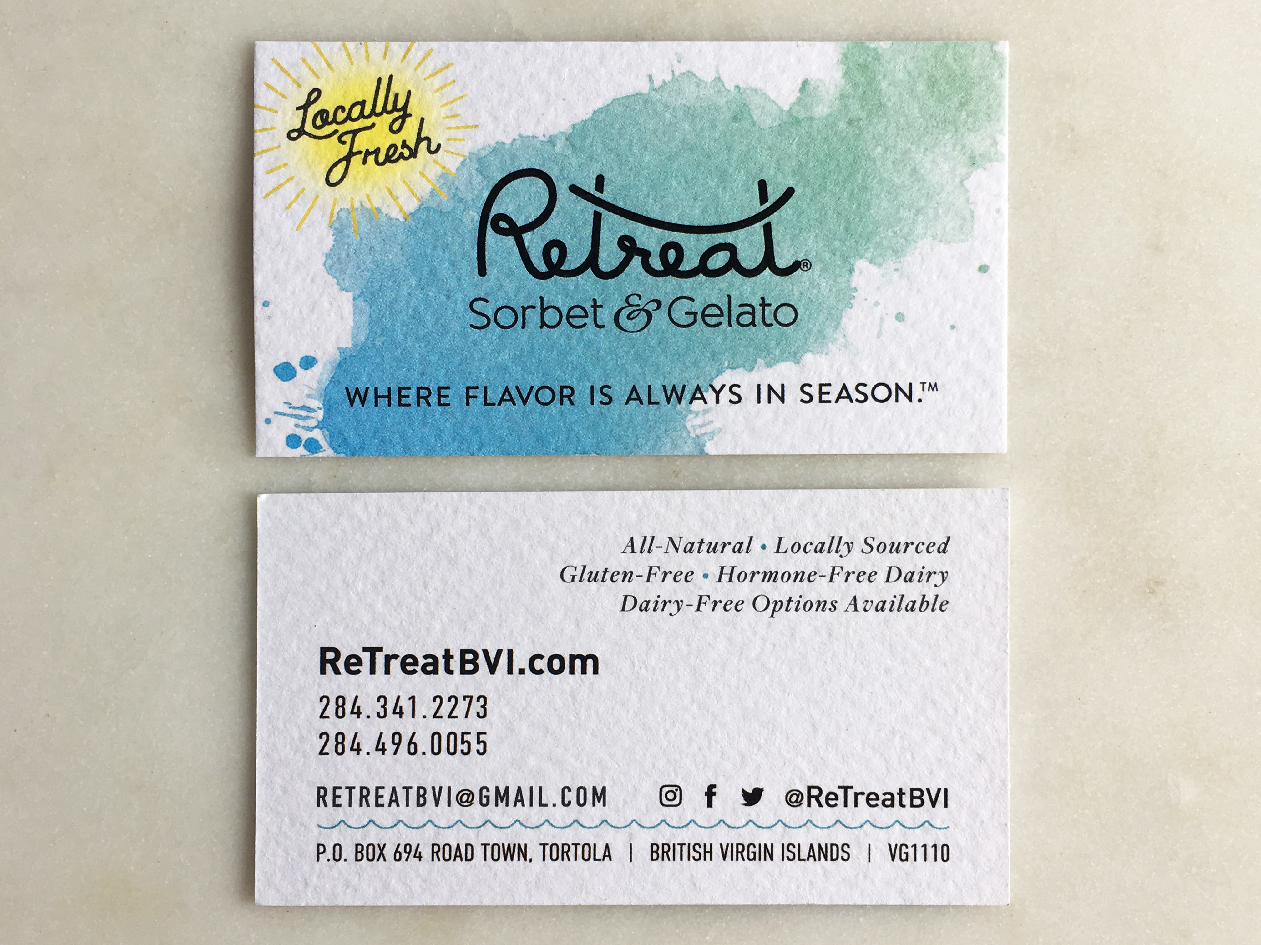
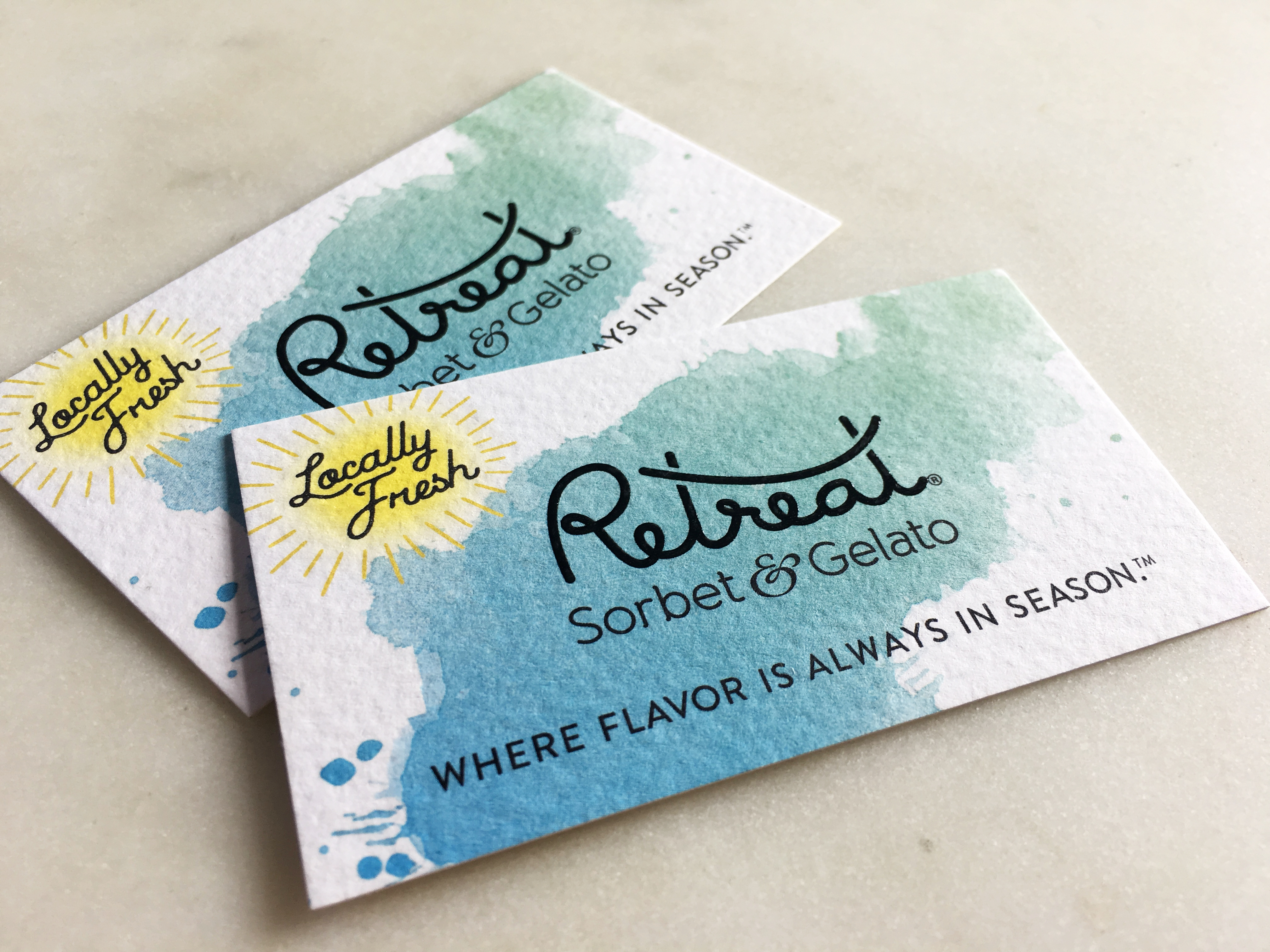
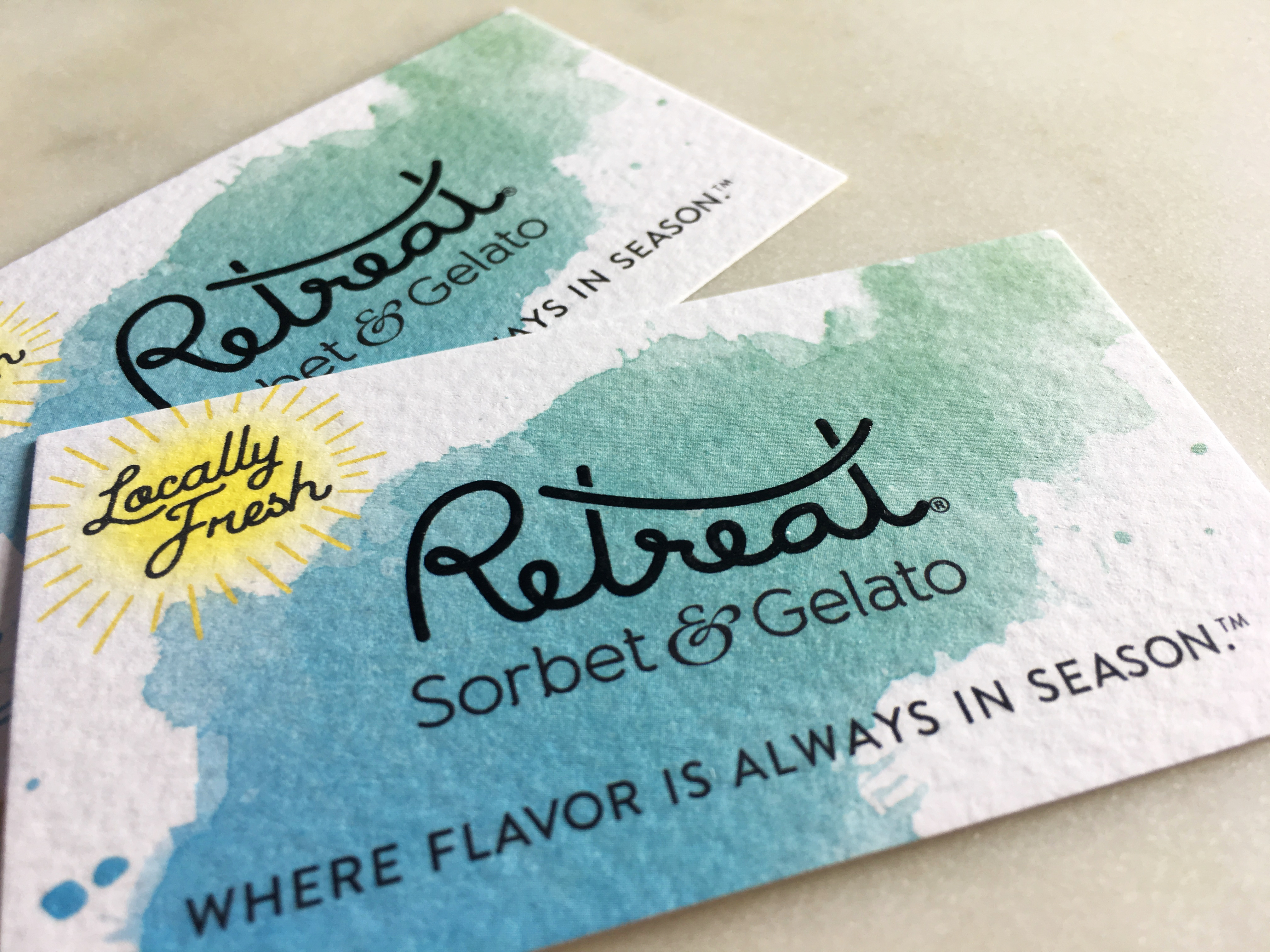
ReTreat®
specializes in artisanal gelato, sorbet, and confections crafted from
all-natural, gluten-free ingredients. A key value of the
ReTreat® brand is the company’s use of high-quality,
seasonal ingredients local to the island of Tortola and the Caribbean at large.
Thus, the use of a paper stock with a natural texture was essential to the
character of the brand.
Â
Â
7. What
made you choose Heavy
Aquarelle?
Heavy Aquarelle is
sturdy and durable. Not only will it stand the test of time, it compliments the
black raised ink treatment and holds ink beautifully.
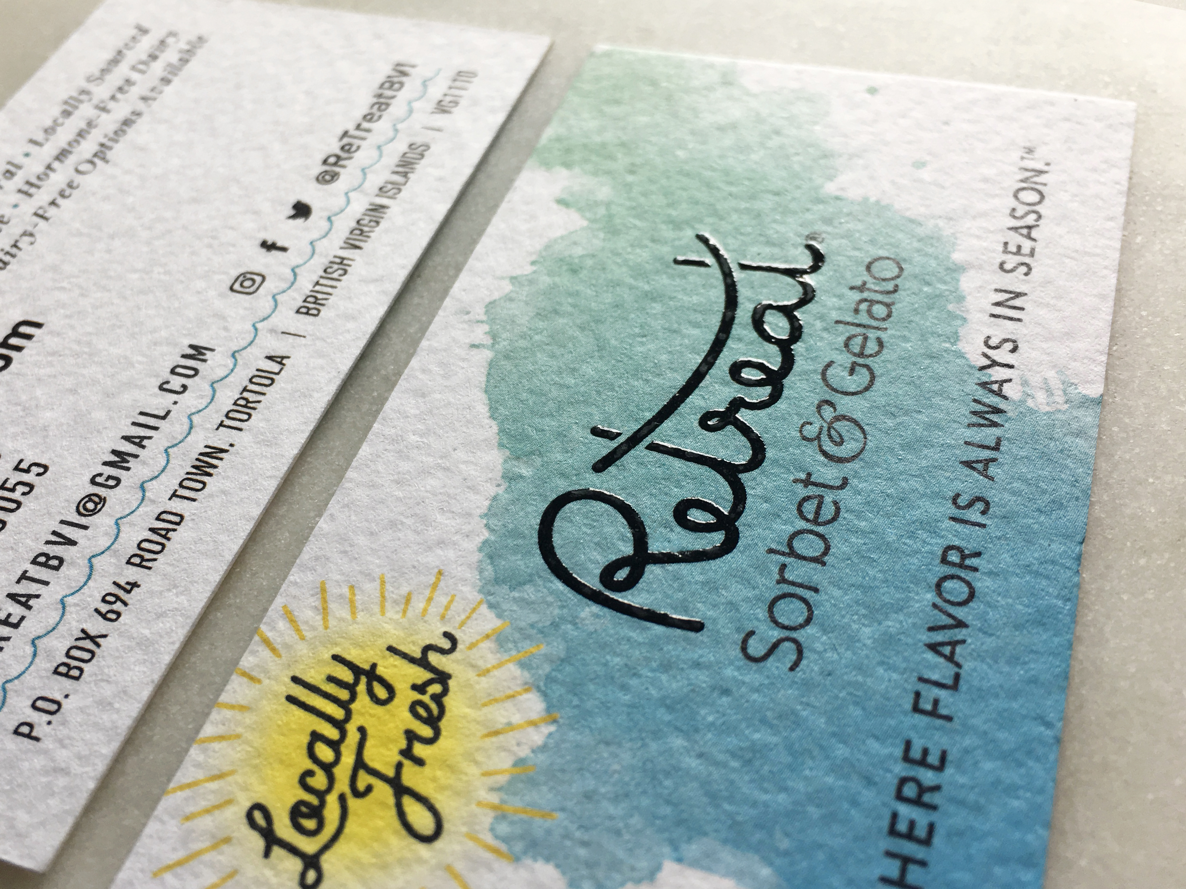
8. We love the Black
Raised Ink on the 'Retreat'. What was your motivation for choosing
this specific finishing option?
While the textured
matte of the Heavy Aquarelle paper stock allows us to communicate
ReTreat®’s all-natural and authentic brand attributes, we
didn’t want the logo to take second stage; therefore, the glossy, black raised
ink helps the logo pop on the card in contrast to the paper stock. The
ReTreat® brand is located on the British Virgin Island of
Tortola and is essentially a paradise all on its own, surrounded by water, so
the glossy raised ink subtly evokes the reflective and glistening nature of the
sea. This touch of “shine,†though small, is effective.
Â
Â
9. What
made you choose MorningPrint?
We’ve used MorningPrint in the
past for many of our clients and find both the quality and value of your
services to be well worth the investment. Plus, your customer service is always
top-notch.
Â
10. How
was your experience with MorningPrint?
Would you recommend us to others?Absolutely! Always have and
will continue to do so. We love working with MorningPrint. You've printed
so many great pieces of collateral for us and so many of our clients, and we
will continue to recommend and use your services as much as possible. Thank
you!


 About Us >
Design of the Month
About Us >
Design of the Month