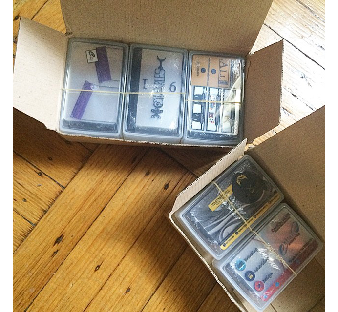
| Hello! Here at MorningPrint, we receive many amazing designs, and we really enjoy seeing the creative process the designers go through. We enjoy seeing the results received after we send these designs to print. We would like to share some of these creative designs with you to help inspire you as they have inspired us. |
|
| Business Card Design of the Month : August |
 |
Name : Harrison Crite
Company Name: Crite Impression
Website : #CriteImpression (instagram hashtag)
Order Details : Clear + White Plastic
|
|
| REVIEW |
| Q : Harrison, please briefly tell us about you, your company, your products and services: |
| A : My Company is called Crite Impression. Piggy backing off making a "First Impression", making the "Crite Impression" simply means my clients using the marketing materials I design for them to promote their business. I am a full service graphic design company that specializes in designing business cards, logos, banners/posters, flyers, social media coordination, Instagram/ Facebook promos and more. "Crite" is my last name. |
|
| Q : Why did you select clear plastic + white stock for this project? |
| A: : I order from MorningPrint weekly if not bi-weekly and the clear plastic + white PET seems to be the most popular stock among my clients. It's a personal favorite of mine as well! I love how it gives you so much variety in sectioning off what areas you choose to be in color vs. transparent. Those pops of color and design on a clear stock really make your business card unique. |
|
 |
| Q : Please walk us through the design process of this project, how did you reach the final concept? |
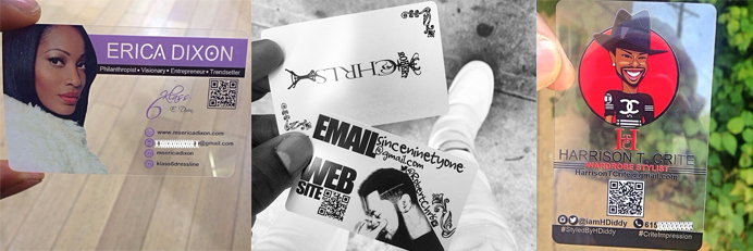
| A: The client specified that she wanted a card incorporating both feminine and masculine qualities because as an event planner she catered to a wide variety of people. I used the client??s current logo as a visual to set the tone of the design by highlighting it in the center of the card for branding. I incorporated lace to cater to the clients request to incorporate "feminine" aspects and sectioned off the contact info with stripping to pull in the cards' masculine features. I used a picture from the client??s website that I thought really showed her skill set to provide her potential clients a visual of her work. |
|
| Q : When working with your clients, how do you get to the bottom of the style / design / products you will offer them? |
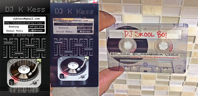
| A: Ha, good question. It really varies. Sometimes clients have a really clear vision of what they want and may lay out all the details in the initial email. Other times clients may just have pictures of their old business card to serve as a reference and simply want me to update it with a new design, while other clients have no clue what they want and trust my creativity to come up with something amazing which actually was the case with this business card. The client just had a logo, and I used that to build the card. It's always helpful for me when clients have somewhat of a vision. I often suggest them drawing it out if they really know what they want to help me with visual placement when designing it graphically. I always think it's best to have a client's business card reflect their personality as well as their business. I love when I'm able to manipulate the square (horizontal) or rectangle (vertical) shape of the card to look like a picture and somehow incorporate their contact info. This sets my cards apart from normal designs. A good visual of this is two cards I made for DJ's. One I made took look like a mixing table and incorporated the contact info in the view finer while another design I made look like a cassette tape and graphically inserted his contact info of a piece of tape. I love getting creative like that. |
|
 |
| Q : A business card gives you limited space, how do you determine what information to use? |
| A: I believe in displaying minimal information and letting either the negative space or the visual design of the card create the WOW factor. I encourage clients when networking to start a conversation and allow that to give the background story to your company versus putting it all on your card. So if a client sends over a lot of info, I take the key elements and use those to design the business card. I utilize a 5 second rule. I put myself in the mind frame of the customer when designing a card, believing that it should take me 5 seconds to look the card over, get excited about the design and understand what it is you do. I've learned from my personal experiences with networking that people's attention rate to business cards is 5 seconds. Either they get excited or they don't. |
|
 |
| Q : Any tips for our clients to consider when they are creating their business cards? |
| A: Sure. MorningPrint offers so many amazing stocks and finishes for your business cards and marketing materials. It helps me when designing a card to envision how it will look once printed based of the type of paper chosen. My goal when designing is to make sure that when you hand someone your card in hand, they won't throw it away and will remember you solely based off the design of the card. I love incorporating pictures on entrepreneur cards so people put a name with a face. |
|
 |
| Q : How has your experience with MorningPrint been? |
| A: I have nothing but good things to say. I always receive my cards on time and if I ever have a question customer service always gets back to me promptly. I feel like you guys know me by name now (lol). Thanks again for this feature! I really appreciate it. |
|


 About Us >
Design of the Month
About Us >
Design of the Month