| Hello! Here at MorningPrint, we receive many amazing designs, and we really enjoy seeing the creative process the designers go through. We enjoy seeing the results received after we send these designs to print. We would like to share some of these creative designs with you to help inspire you as they have inspired us. | |
|
|
|
 |
 |
| REVIEW |
| Q : Briefly tell our readers about you and your company: |
| A : Wolf Studios is an independent development company focusing on games and apps. It's just my wife and I. She handles the business side and networking with others, and I do the designing and development. I've been doing graphic design, programming, music composition, and writing since a very young age. Most recently, I released a series of word games on iOS called War of Words. I never sit still-right now I'm designing a table-top game and writing a novel. | |
| Q : Looks like this is your first order with MorningPrint. How did you find out about us and did you shop other printers? |
| A: I found MorningPrint through a Google search, and I did check out a few other printers. I was specifically looking for clear or translucent plastic cards. They varied quite a bit, from very thick and expensive credit-card-style cards to the very thin cards MorningPrint offered. I decided I preferred the thinner stock. MorningPrint was also far more affordable than the alternatives, and that certainly helped! | |
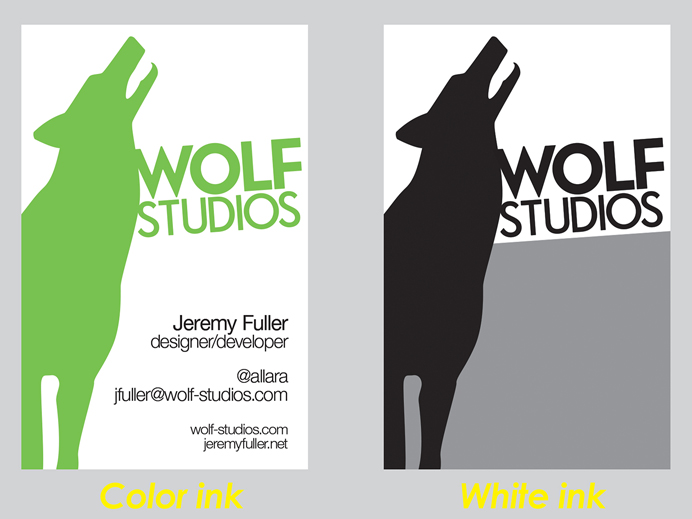
| Q : You selected our clear plastic + white ink. Why did you select this stock? Had you printed on PET plastic before? |
| A: I wanted to do a card that was very unique. To achieve that, I wanted to play with transparency and plastic. This was my first attempt at any sort of plastic business card. I have experience designing screenprinted textiles, so I knew a white plate would be very helpful in this case. I tried designs for the gold and silver plastic cards first, but wasn't happy with the results in Photoshop, so I decided to go with clear plastic. | |
| Q : What was your design process like for creating your card? |
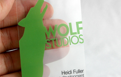
| A: Initially, I struggled with it a lot. I tried several radically different approaches. It's very hard to simulate transparency in Photoshop in a way that the eye can visualize without seeing the finished product. My favorite color is green, and in the end I thought simple was better. I didn't want to see a lot of obvious rasterization artifacts, so I went with solid colors and a dramatic full-bleed design. The 4.5 degree rotation on the logo was an inspired final touch that really pushed the design to the next level. The white plate helped not only pop the color more (green is hard to achieve using CMYK), but it also added an extra dimension to the transparency effect. | |
| Q : Your design is simple yet effective and draws a lot of interest by playing off the transparency of the card, how did you come up with this? |
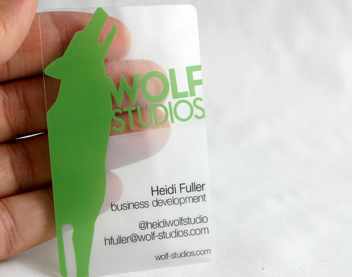
| A: Designing for transparency is a very different approach from traditional designing. I had looked at using translucent plastic, but thought dramatic full transparency combined with a white plate would be a better choice. I wanted people to really notice the transparency, but also be able to easily read the card, so I opted for a large and bold logotype. I'm very picky about wolf illustrations, and I love how this one really owns the side of the card in a dramatic fashion. (I guess drama was my main goal!) If the whole card had been transparent, it wouldn't have been as noticeable. That's why I did 30% white along the bottom half of the card-not only does it emphasize the transparency by providing some contrast for the world behind the card, but it also aids in reading the smaller type at the bottom. After struggling so much, the final design ended up happening very quickly. Sometimes inspiration strikes! | |
| Q : For future cards will you stick with the clear plastic or explore any other stocks and options? |
| A: I've had incredible reactions to this card so far, so I might continue with this design for a bit. But I'm always looking for change, so the odds are good that I'll do a new design soon, and that probably means a different stock. I'd like to play with nonstandard sizes and die cuts, as well as metal. I hate boring, and business cards can be the epitome of boring. | |
| Q :Any tips for our clients to consider when they are creating their business cards? |
| A: Simple is better. Make sure you use a professional designer who understands the nature of offset printing, including bleeds and the cutting process. And don't be afraid to think outside the box. | |
| Q : Did you experience any difficulties when using MorningPrint.com? |
| A: Nope! The cards arrived exactly as I designed them. I was very happy with the price, speed, and quality of the product. | |
| Tips |
 |
| Clear + White ink allows you to express areas of white as well as back areas of color with white as seen in the example. Colors printed at 100% opacity will still have transparency as is the nature of these cards, backing areas with white ink will help the colors to be more saturated making the design / information easier to see. Please see more ... | |


 About Us >
Design of the Month
About Us >
Design of the Month