Here at MorningPrint, we receive many amazing designs. Knowing the motivations behind those designs and the process of what went into the creation of them, is something we feel is our duty to highlight and pass on to our readers. Particularly any aspiring designers needing a good resource for inspiration. We are honored to be able share some of those inspiring designs with you as part of our Design of the Month series.
Business Card Design of the Month :Â October
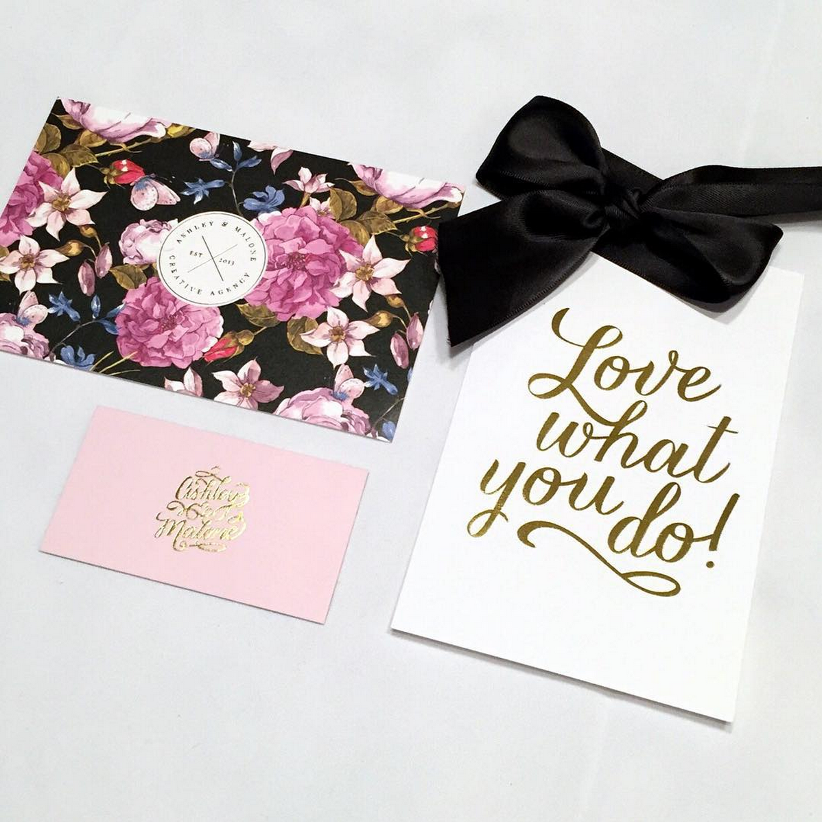
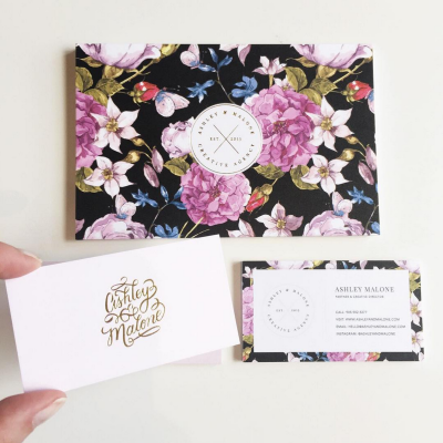
October’s Design of the Month is a branding package designed by Ashley & Malone. If the name sounds familiar to you, it’s most likely because Ashley & Malone was our Design of the Month a few years back. Ashley & Malone has come quite a long way since they were last featured on our site and we were so impressed with their brand makeover, we knew we had to feature them again. We spoke with Partner & Creative Director, Ashley Thatcher, about their design evolution.

Company Name: Ashley & Malone
Designer: Ashley Malone
Website: www.ashleyandmalone.com
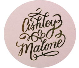
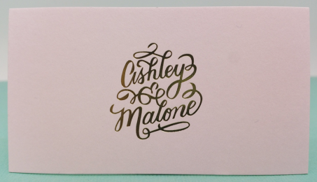
Order Description: Sumo Nouveau + Gold Foil / Linen + Gold Foil (Post Card)

---------------------------------------------------------------------------------------------------------------
Q: For all of our new audience members out there, would you kindly give us a refresher on your company & services?
A&M: Ashley & Malone is a boutique branding and web development agency that caters to wedding pros and lifestyle brands. We ensure every touchpoint of your brand not only makes you look like the expert, but is a true reflection of you. By translating your style, values and the “why†behind what you do into purposeful design and personalized details from print to online.
Q: Your prior card design was quirky, colorful & textured. Your new design is quite a departure, in a good way! It’s classic, ultra-feminine & utilizes more traditional design elements, mixed with just the right amount of pizazz from the gold foiling. What were the goals for this new design aesthetic & how does it reflect the growth of your business?
A&M: We've evolved quite a bit as a company in the last few years! Ultimately we started servicing more established business owners and matured in our design aesthetic. This evolution has allowed us to continually work with the type of clients that we love and has opened new doors to amazing lifestyle brands. Our clients are generally in the luxury market and we needed our brand to reflect that as well. I want our clients to feel like they're stepping into a designer boutique where they receive the ultimate experience.
Q: In regards to the traditional design elements I was speaking of. It is really difficult these days to see Serif Font, juxtaposed with San Serif Font. And the rare times it is seen, it’s often executed poorly. What are your tips/tricks for successfully combining typefaces?
A&M: I have a rule of thumb to only combine one type of font in a brand. For our personal brand, our logo was created by calligrapher Molly Jacques, so our complementary brand fonts are a professional serif font and a modern sans serif font. Using these three combinations allows us to meld classic details with a contemporary presence. Personally I wouldn't use more then three fonts for a business. Your fonts should also reflect the personality of your brand.
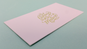
Q: You chose to go with our new super-thick, Sumo Nouveau paper stock. It really loves finishing options, especially foiling. How did you come to the decision to go for a thicker card stock & did it live up to your expectations?
A&M: I'm SO in love with this new stock. I've been using the Heavy Nouveau for years and was secretly hoping you would introduce something more substantial. In the wedding industry paper is super important so these cards have a grand presence and a super luxe weight. It's the ultimate stock when you want an impressive card. The gold foil just sets off the entire look and adds an element of glamour.
Q: What are your key elements for good design?
A&M: I'm a firm believer in classic design with personality. Less is always more and all design should be properly balanced with enough white space. Allowing the design to breath and giving each element hierarchy is the most powerful way for the audience to understand what they're looking at. You want to guide a persons eye through a design. For example on your business card, your logo and name should stand out the most. Once they're captivated, they will look further for your contact information!
Q: Lastly, you’ve used our printing services more than a few times. First of all, thank you! Second, what is it about our company that keeps you coming back?
A&M: I've been using Morning Print since you opened and I always recommend them to my clients who require luxury print details without spending a fortune. I can also always rely on the company to print on-time and quickly. Consistency is always there with Morning Print!
Morning Print would like to thank Ashley & Malone for contributing to this blog post and their ongoing support of our products + services. For more information on Ashley & Malone, please visit their website.
Ashley & Malone Contact Details:
41 King William St #201, Hamilton, ON L8R 1A2, Canada / T: 905-902-5277
https://www.facebook.com/ashleyandmalonedesign
https://twitter.com/ashleyandmalone
Â


 About Us >
Design of the Month
About Us >
Design of the Month