Design of the Month for November is Thistle & Purple Tattoo, designed by Brittany Brunken
Here at MorningPrint, we receive many amazing designs. Knowing the motivations behind those designs and the process of what went into the creation of them, is something we feel is our duty to highlight and pass on to our readers. Particularly, any aspiring designers needing a good resource for inspiration. We are honored to be able share some of those inspiring designs with you as part of our Design of the Month series.
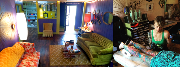
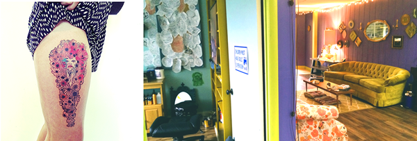
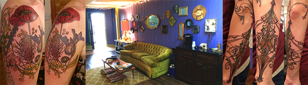
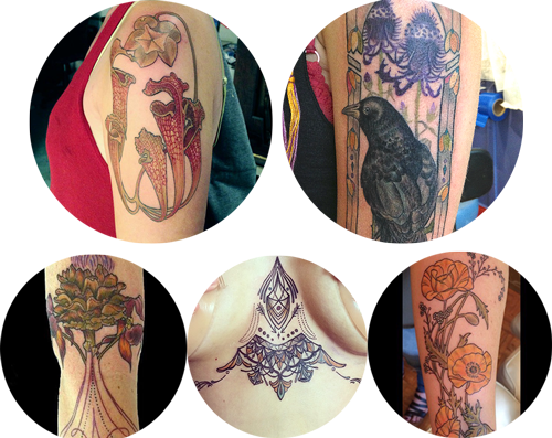
November's Design of the Month comes from Thistle & Pearl Tattoo, a cozy tattoo shop based in Asheville, NC. Thistle & Pearl offer intricately designed tattoo art using cruelty & petroleum-free products. Their other services include Henna art, piercings & Reiki Healing Techniques.
Artist, Brittany Brunken, took some time out to talk to us about conscientious tattoo practices, inspiration from the Art Nouveau movement & her love of gold.
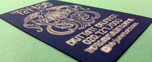

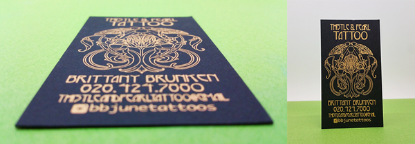
Company Name: Thistle & Pearl Tattoo
Designer: Brittany Brunken
Website: www.thistleandpearltattoo.com
Order Description: Black Paper + Matte Gold Foil
............................................................................................................
Q: Please briefly tell us about you, your company and your products and services:
T&P: We are a Tattoo and Piercing shop that prides ourselves on our high standards and client satisfaction. As tattoos are something often very personal to the individual, we believe in paying attention to detail and taking time with each and every client.
Our shop strives to be a very comfortable environment in which our artists produce quality, custom designs that our clients are proud to wear on their bodies. Because most of our designs are custom, we almost always do consultations before the tattoo appointment itself. This helps to insure that the one of a kind designs are exactly what our clients are looking for as they will have some time to sit on the final drawing before making that lifelong commitment.
We use vegan ink/cruelty free products and are petroleum free. Tattoo ink does not require FDA approval so it is really up to us, as artists to use safe, high quality, durable ink, which we do! Additionally, petroleum (which is typically used both during the tattoo procedure and after, as an aftercare product) can actually slow down the healing process of the tattoo causing the loss of pigment and therefore creating a less vibrant tattoo.
After careful research, we found a cruelty free product that achieves the same benefits during the tattoo process as petroleum without the adverse effects. For aftercare, we offer a high quality locally made, organic, petroleum and cruelty-free product for both piercing and tattoos called “Zenâ€.
Q: We LOVE the art nouveau style used in your design. Alphonse Mucha would be impressed! Since this particular style is rarely seen these days, how does it connect with you as an artist?
T&P: For me personally, Mucha has been one of my biggest influences as well as Edmund Dulac, Kay Nielsen, Aubrey Beardsley, etc. I have adored the Art Nouveau style since I first laid eyes on it in one of my children’s books growing up. Unless otherwise specified, I almost always have Art Nouveau elements in the composition of my tattoos. To me, this style is tireless, timeless and classic. This is an important aspect in tattoo design because so many designs over the decades are a reflection of whatever the trend was at that given time. However, Art Nouveau-style designs will always be beautiful and never dated.
Q: What is the meaning behind your logo?
T&P: Our logo is basically an Art Nouveau-style thistle with a pearl hovering overhead, in literal representation of the shop name “Thistle and Pearl. I wanted something that I felt accurately represented my style as an artist.
Admittedly, it took me dozens of attempts before finally creating this one. With the help of my apprentice, Emma Bolan, I was able to create a clean, crisp vectored version of the original pencil version. I chose a thistle and a pearl in naming the shop because I felt they invoke a certain visual which seemed to appropriately allude to the shop’s artistic aesthetic. Thistle, because it is a very striking, unique, and beautiful flower, yet painful to the touch…just as are tattoos. The word “pearl†seems to soften the implications of the sharpness in the word “thistle†and there is certainly a softness and elegance to the majority of designs we produce.
Q: The Art Nouveau color palette is typically filled with earthy, nature tones. You chose to print your final design with Matte Gold Foiling on black paper, which is more of an Art Deco design aesthetic. What led you to make this choice and was it an intentional blend of design styles?
T&P: It was definitely a conscious decision but I’d say it was less to do with the intention of blending the two styles and more to do with marketing. I have had all sorts of colored business cards in the past, including cards with photos of tattoos, cards with images of tattooed circus ladies from the 1800’s, etc.
The cards that seem to have left the biggest impression in clients’ minds are the cards with gold foiling. I have had clients tell me they were “instantly convinced†that I was the artist for them based EXCLUSIVELY on my business card alone.
Also, ask any of my coworkers and they’ll tell you my fingertips are often coated in gold spray paint. This is because gold is one of the main colors in the color palette of the shop (being lilac, moss green, gold, mint green). So, it made sense for me to have gold lettering on my business cards. ;)
Q: Morningprint offers Glossy or Matte gold foil finishing. Glossy gold foiling is usually the more popular of the two. What did you like more about the Matte Gold foiling?
T&P: Honestly, I have not seen the Glossy gold foiling in person, so I can’t give an answer based on any sort of frame of reference. However, I tend to feel that Matte colored ANYTHING is classier that Glossy. Just a personal preference though and I have no idea why!
Q: How has your experience with MorningPrint been thus far?
T&P: My experience has been fantastic. The cards came in a very timely manner and the detail on the printed cards is pristine. I was a little nervous about it beforehand because there are so many tiny lines and details in the logo, but MorningPrint absolutely nailed it! Also, I used to order my business cards from Moo. I now can get the same exact card (if not better) for a fraction of the cost and at quicker delivery from Morningprint. I’m never going back!
Q: Any other thoughts or suggestions you would like MorningPrint/readers to know?
T&P: My only thought would be to offer a vertical template in the build/design your own card section of the website. There seems to be the ability to rotate the lettering but I could not get the entire uploaded image itself to rotate (I am designing additional cards for coworkers with a similar, though not identical style).
Morning Print would like to thank Thistle & Pearl Tattoo for contributing to this blog post and their ongoing support of our products + services. For more information on Thistle & Pearl Tattoo, please visit their website.
Thistle & Pearl Contact Details:
107 Merrimon Ave. Suite 310
Asheville, NC 28801
(828) 424-7880
Follow Thistle & Pearl on Facebook
View Thistle & Pearl on Instagram
Â


 About Us >
Design of the Month
About Us >
Design of the Month